Indeed
Wireframing
Overview
Design Team
Selena Yip, UX Designer
Timeline
6 weeks
Indeed is a global job matching and hiring platform. Indeed puts job seekers first, giving them access to search for jobs, post resumes, research companies and more. Since the global pandemic lockdown in 2020, many industries have completely changed the way that they operate. Indeed CEO, Chris Hyams, told WSJ in a 2021 interview “...there are entire sectors that are shut down, so people are having to turn to new opportunities. That’s really where our focus has been. How can we make that simpler and faster for people to get a job?”
Problem
Job seekers dislike using Indeed because they have difficulty navigating the app and are often unable to find information that is important to their job search and career development.
Goal
Increase app usability and encourage users to explore unique features and resources so that users can find a career and jobs that they’ll love.
Competitive Analysis
There is a wide array of job search engines that serve different user bases and industries. While some of Indeed’s competitors focus on more specific or niche industries, I focused on three companies that have a similarly serve a broader range of industries.
Strengths
Weaknesses

tags increase understanding of listings at a glance
“active date” provides transparency about review timelines
app organization is confusing
sometimes the search results are not relevant to the query

has a social media networking “feed”
shows “connections” that work at companies that are hiring
listing date is not always easily located
lots of recruiting companies and third-party employers posting
has a forum-like aspect to the app called “bowls”
minimally designed job tiles make search results less overwhelming
because there is less information in the initial job listings, users do not get all of the information that they need at a glance

company review/score is visible on all listings
job tiles contain clear information hierarchy
unable to edit user profile within app
Findings
All competitors had clearly labeled navigation bars so that users can more quickly access large groups of information, such as “Saved Jobs” and “Profile”.
Having a social interaction component to the job seeking app (like LinkedIn) makes the app more attractive because its navigation mimics that of apps that users are typically using in their personal day-to-day (such as Facebook or Instagram).
Interviews
I interviewed five friends (aged 25-40s) working in different industries and at varying levels of their career who are either currently seeking of have sought jobs in the past. They have all used job listing websites to search for jobs, but only some have successfully gotten interviews.
I asked the interviewees for some of the goals and tasks that they achieve on job websites:
Search for jobs and save them for later
Look for career information (ie: average salaries)
See what kinds of jobs are available in the market
Write company reviews and answer questions
Create/edit a discoverable user profile
Under my observation, users were asked to search for a job related to their industry. Below I’ve outlined one of these user journeys.
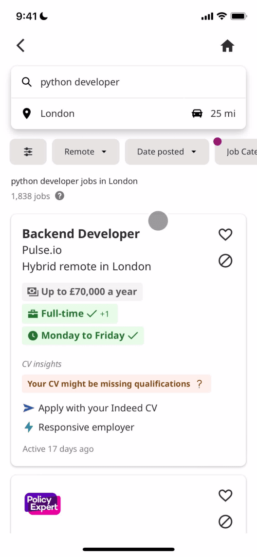
Homepage
Search Bar
Search Results
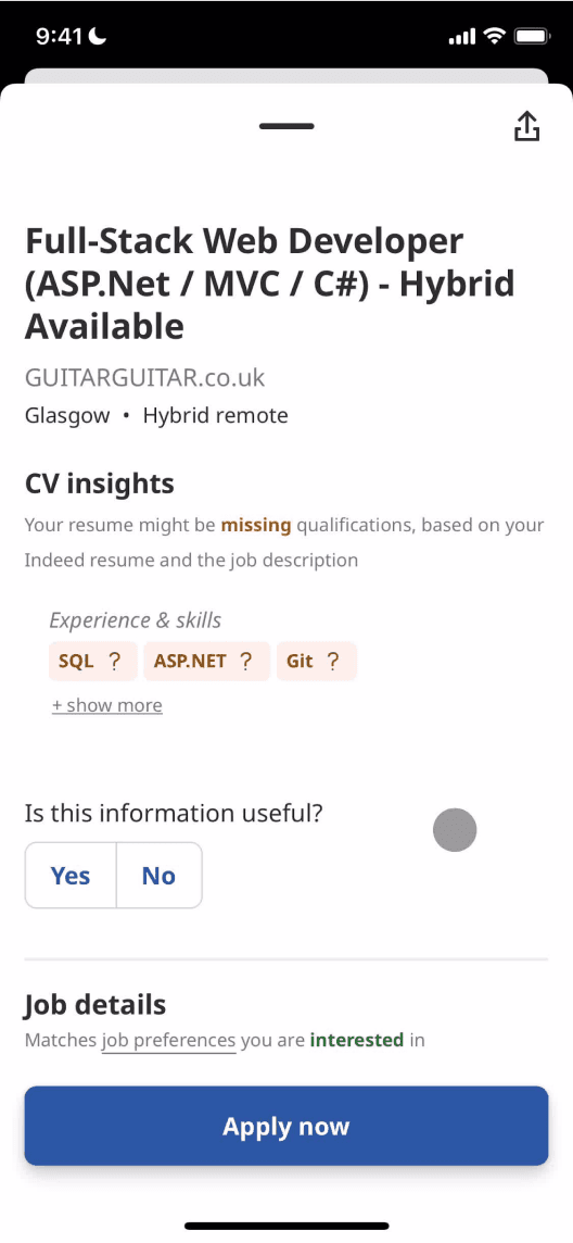
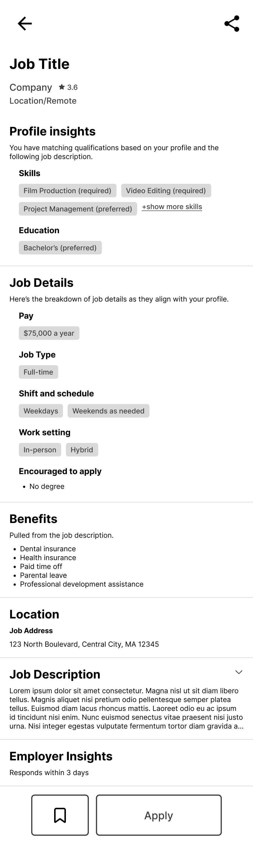
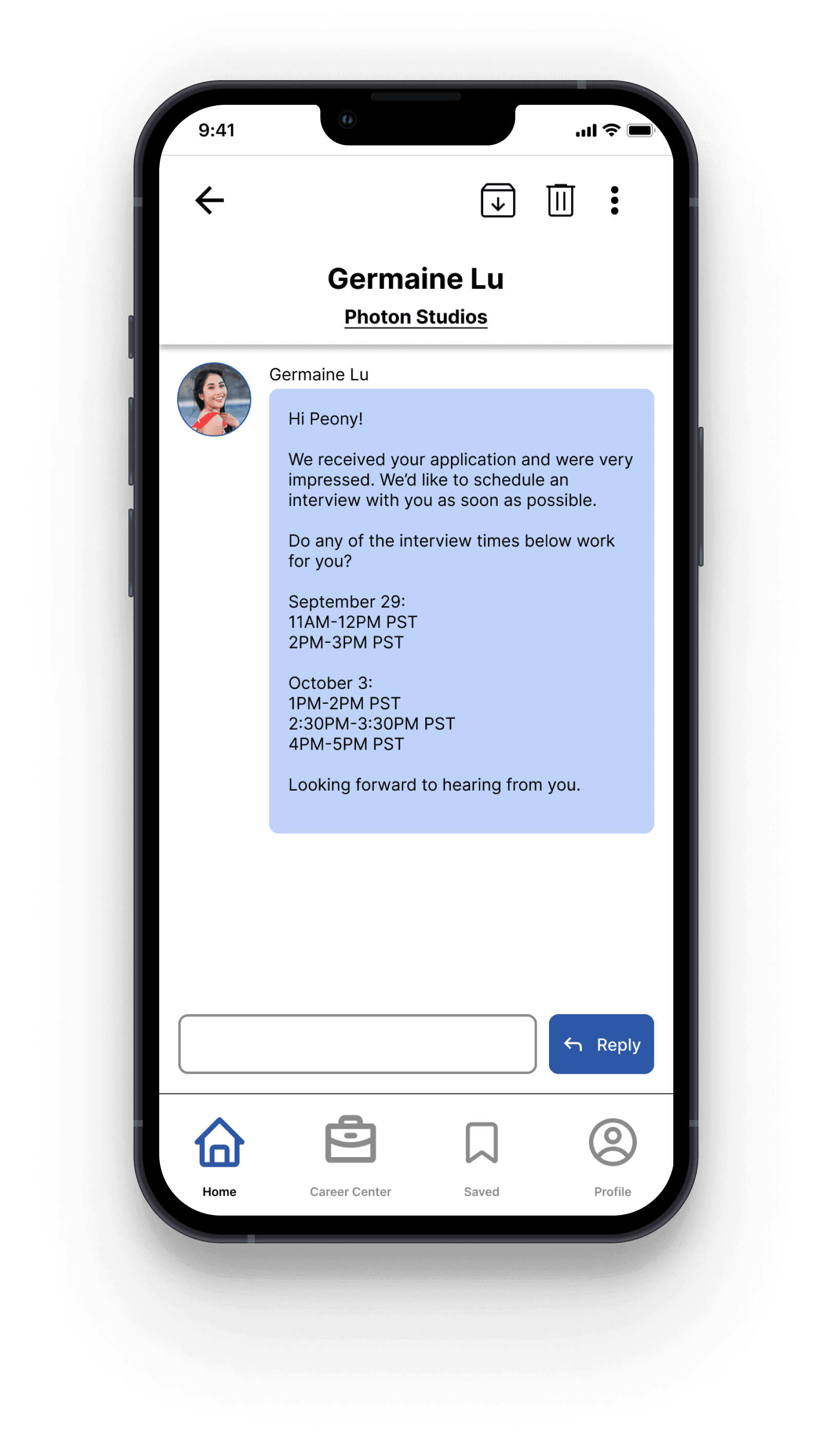
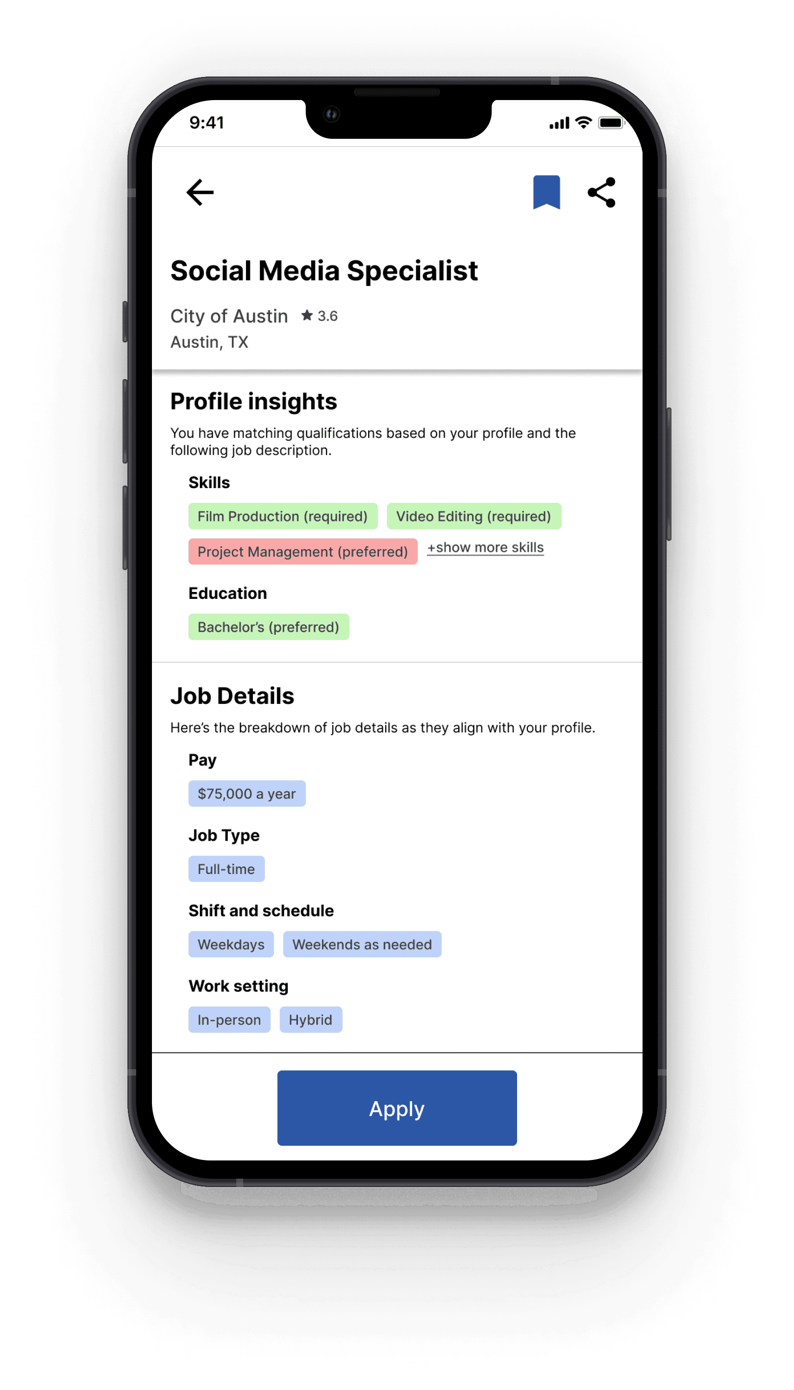
Job Posting
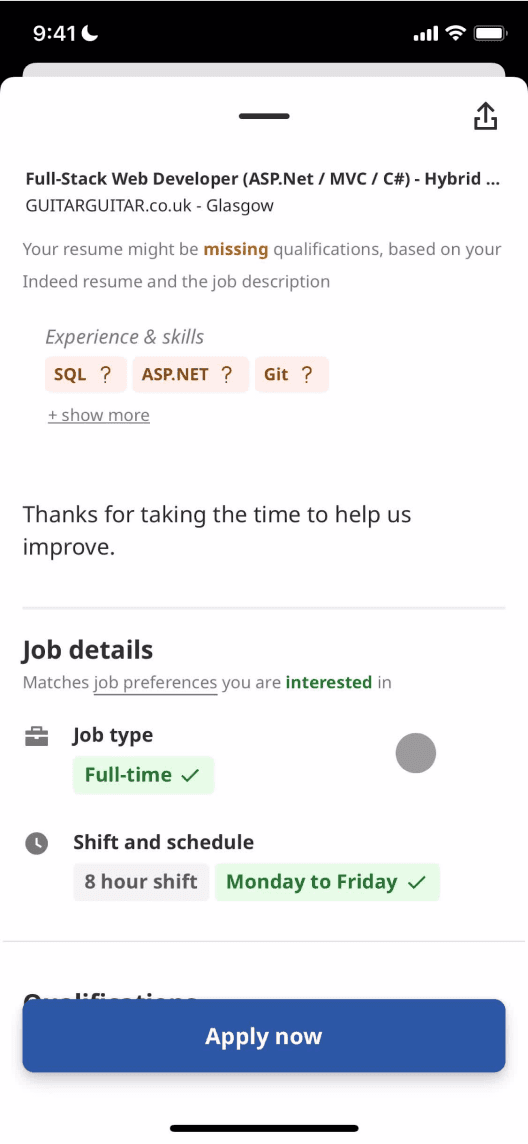
Job Posting (cont’d)
Quotes:
“I wonder whether there are job openings in my industry.”
“I’m not sure whether my search will yield the results that I want...”
“I’m not able to find the kind of jobs that I’m looking for.”
“I have these qualifications that they’re looking for!”
“Where can I find the job benefits?”
Satisfaction:
User Goals:
Browse recommended jobs
Search for jobs in the desired location
Research careers
Search for a job in the desired location
Search for a company or career
Browse results search query
Explore, save, and apply to interesting jobs
Read through job description to see whether job is a match for skills and needs
Save job for later
See whether the job is a match for user’s skills and needs
Learn more about company and role
Apply to job
Strengths:
User goal can be achieved quickly
Sections on page are clear
Ability to search by different inputs (keyword, job, etc...)
Job listings contain high-level information such as location and schedule
“missing qualifications” allows user to identify quickly whether they are a match
“Apply Now” button is clear and remains on-screen while scrolling
Quick indication of whether the job “matches” user needs
Pain Points:
Mobile footer organized like a webpage footer
No quick way to access other parts of the app such as user profile or Indeed for Employers
No way for user to select what kind of search results they are looking for (ie: list of companies, list of open jobs, or list of careers)
Not all search results are related to the query, which can be frustrating
Search does not yield results about the career generally
Unable to save job once the job description is open
Some job match info is incorrect, despite user having input preferences
Possible Solutions:
Add more sections to homepage that link to other app features
Allow user to select between different results tabs
Indicate why results are being shown (ie: “We found these results based on “coffee” “cafe” and “barista””)
Add a bookmark/save button next to share button
Allow users to fix preferences on the same screen
Findings
All users stated that Indeed was their least preferred job search app because of the confusing navigation.
All users felt that their search queries yielded the desired results. Even though the search bar states that “keywords” or “companies” can be searched for, the results only ever yielded job postings.
No users knew about Indeed’s career services or resources such as a list of top-paying industries and career coaching.
Determining Scope
After reviewing the findings from interviews and competitive analysis, I concluded that the best way to increase usability would be to...
Navigation
Help users more intuitively explore and access app features by designing clear navigation bars.
Career Resources
Encourage users to utilize Indeed’s wealth of career information by creating a centralized place to find these resources.
Categorized Search
Minimize friction in a user’s job search journey by redesigning the search page to allow users to specify the category of results they’re looking for.
Information Architecture
In order to improve app navigation, I first had to get a better understanding of the app’s content. After taking inventory of the Indeed app content, I created a draft site map based on how I understood groupings of the content.
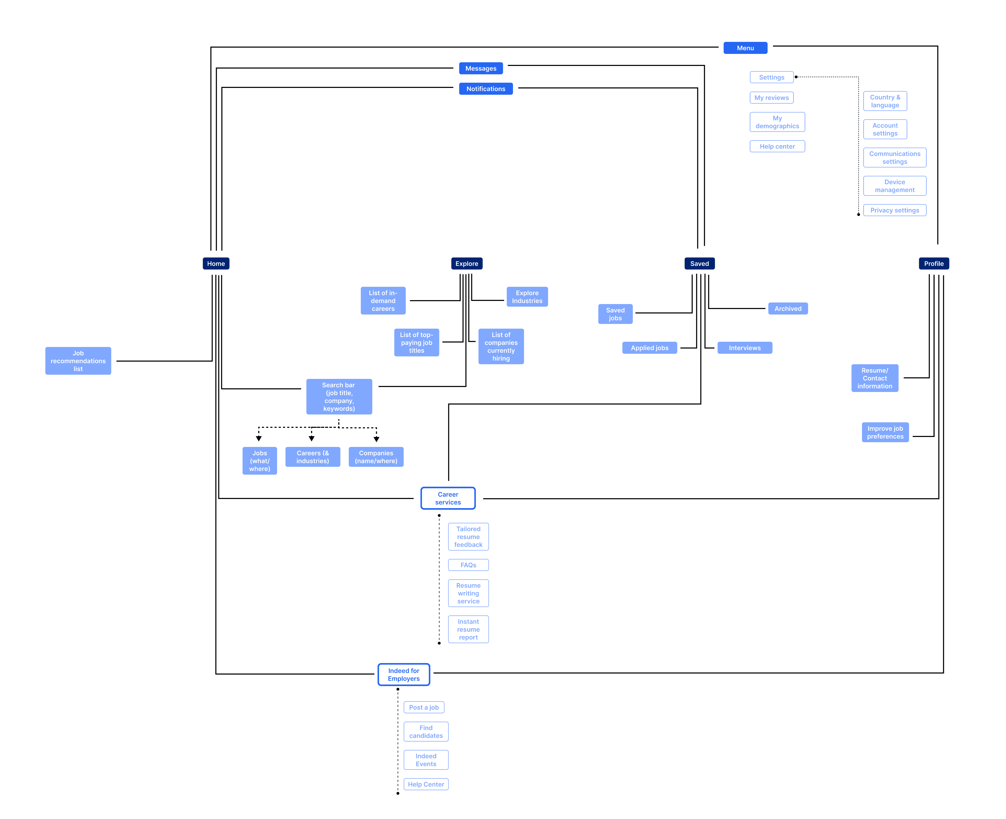
First draft of sitemap
Using a card sort, I observed how seven users grouped the same content so that I could get a better idea of their thinking patterns and understandings of certain phrases/content titles. Users were also allowed to create their own group titles if they felt that the titles provided (Home, Explore, Saved, and Profile) did not fit into their understanding.
Findings
71% of users understood “Profile” to be a private page and sorted cards that may be typically private information such as “my company reviews” and “my demographics” under this category
28% of users noted that some of the cards could easily be sorted into multiple categories (For example: “job recommendations” could be in “Explore” or “Profile”)
One user thought there should be a dedicated “blog” page for career advice and other job market articles
Most users referenced social applications like Instagram, Twitter, or even LinkedIn to describe how they understood information organization
After analyzing the card sort data, I was able to create a final iteration of the app’s information architecture. The most significant change from the first draft is the Career Center, a page that contains the unique resources that differentiates Indeed from its competitors.
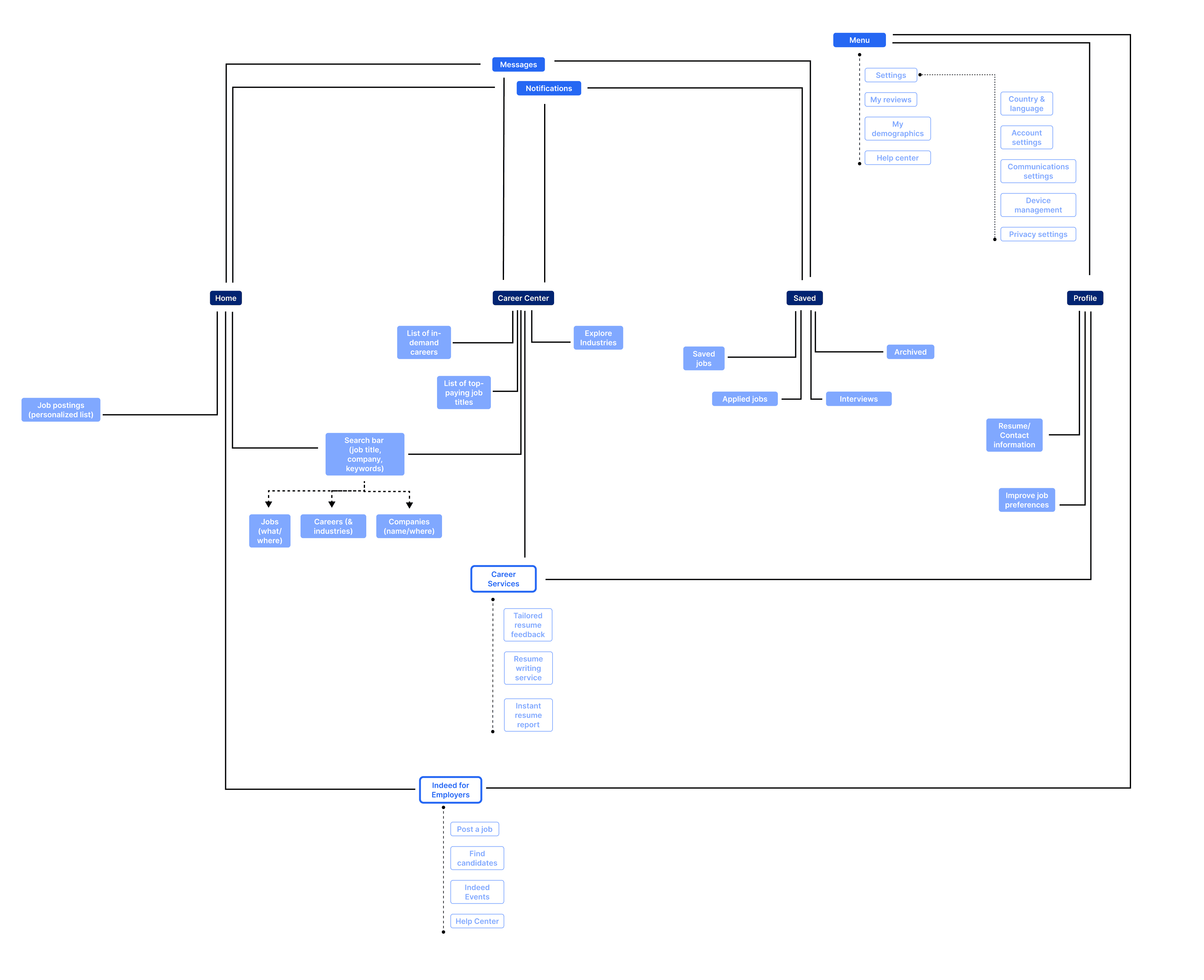
Final draft of sitemap after analyzing card sorting data
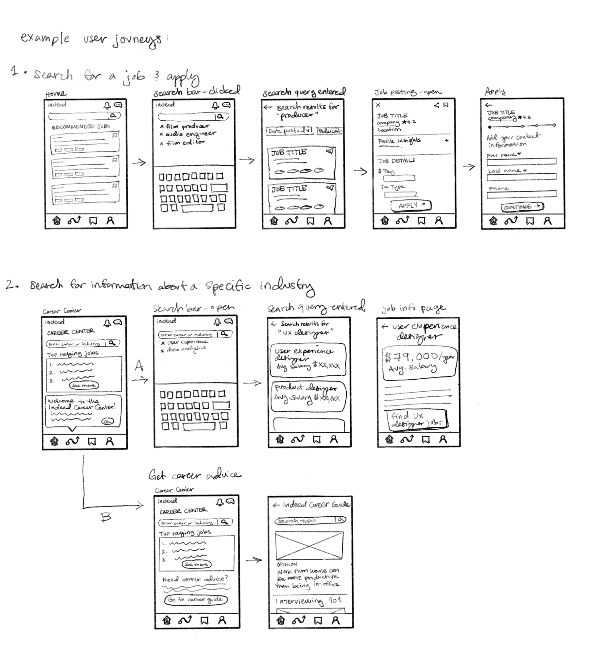
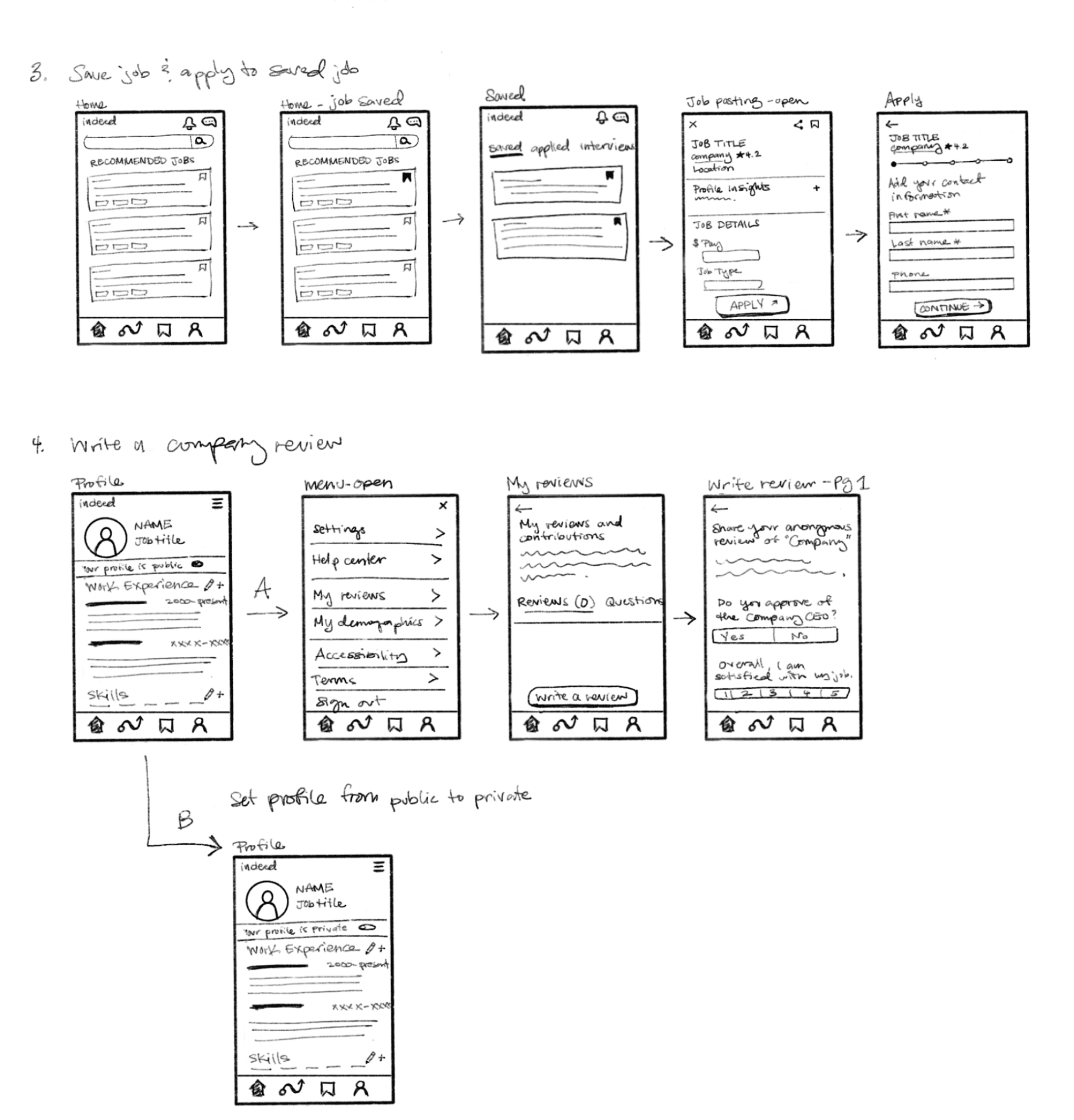
Sketching and Wireframing
I sketched out four different user journeys that I imagined my personas would take when using the Indeed app. From these sketches, I created wireframes that informed the final hi-fi prototype.
Initial wireframe sketches
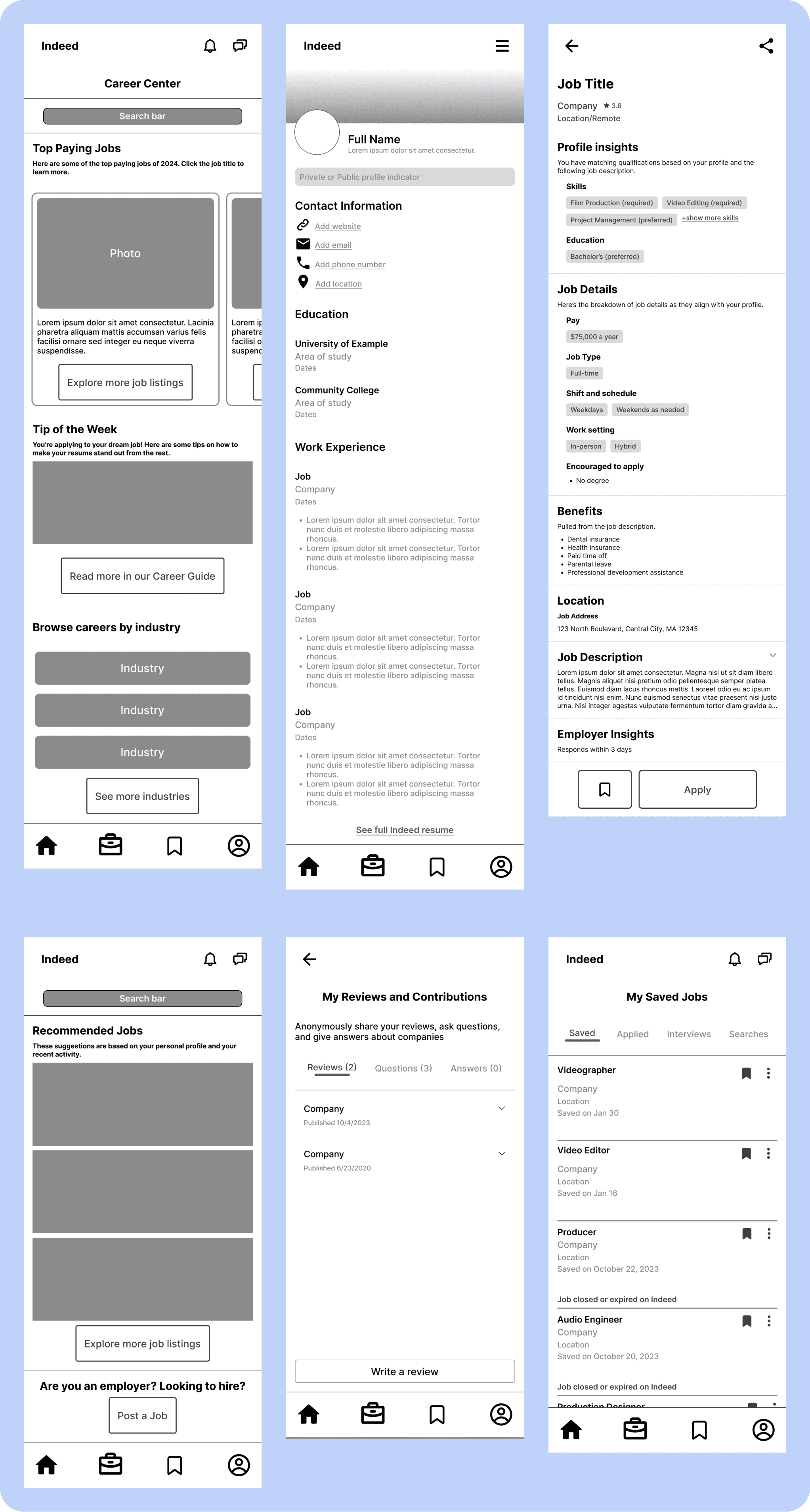
Mid-fi wireframes
High Fidelity Prototype
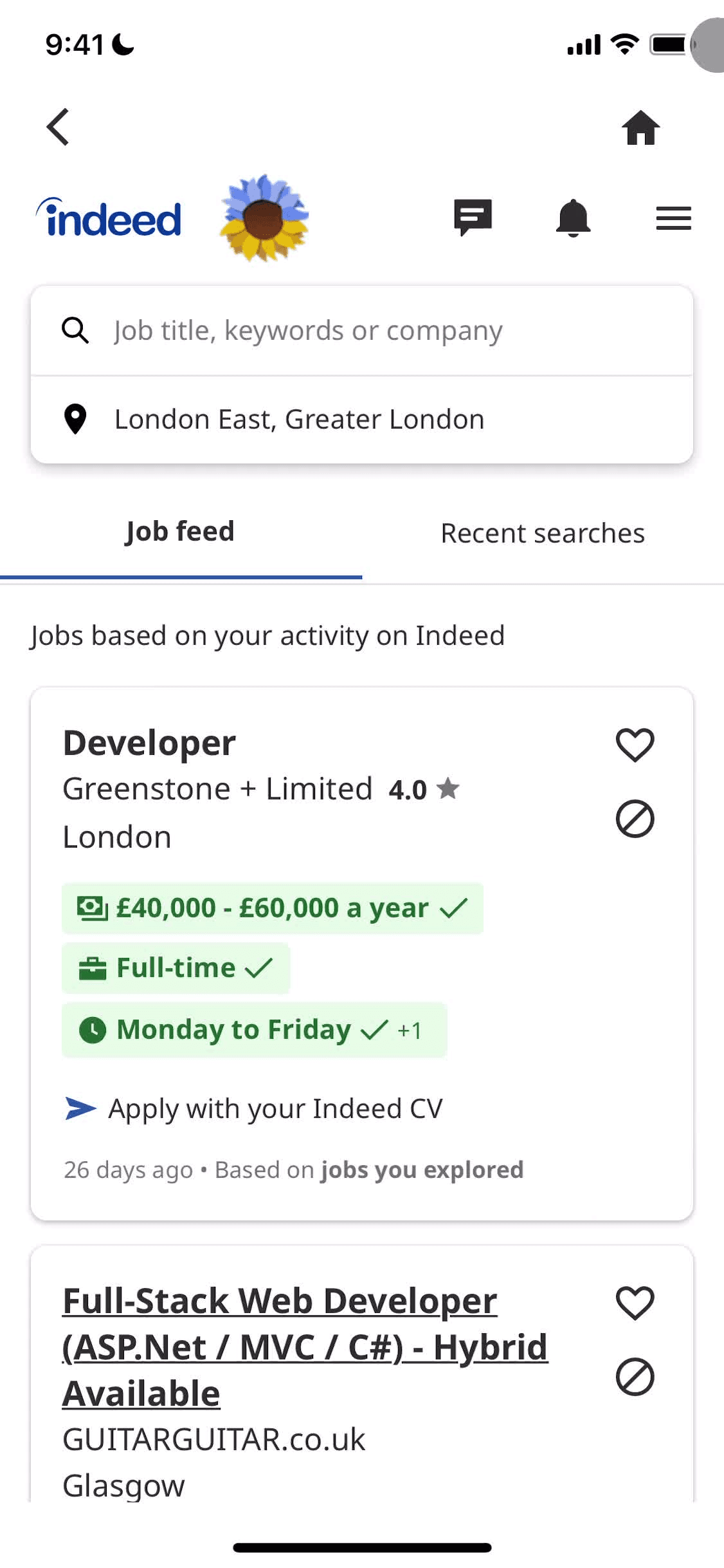
Prototype Testing
I asked three users to participate in prototype testing to see whether ease of navigation had improved. I asked users to achieve the following goals and observed their journeys:
Search for a job in film & apply to the first job
Search for the average salary of a Film Producer
Look for career advice in the Career Guide
Save the first job from your job recommendations & apply
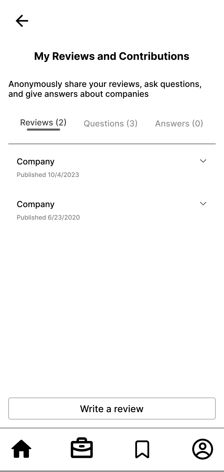
Write a company review of an employer you’ve worked for
Set your profile from private to public
Findings
Users spent an average of 35 seconds to complete each user journey, with the longest time spent on “write a company review” (60 seconds)
Users had the most misclicks when trying to “write a company review”, with the most misclicks happening after clicking into Profile
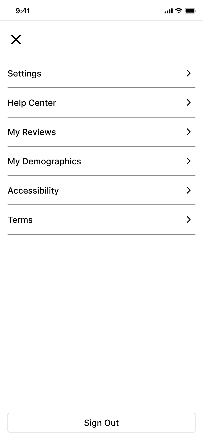
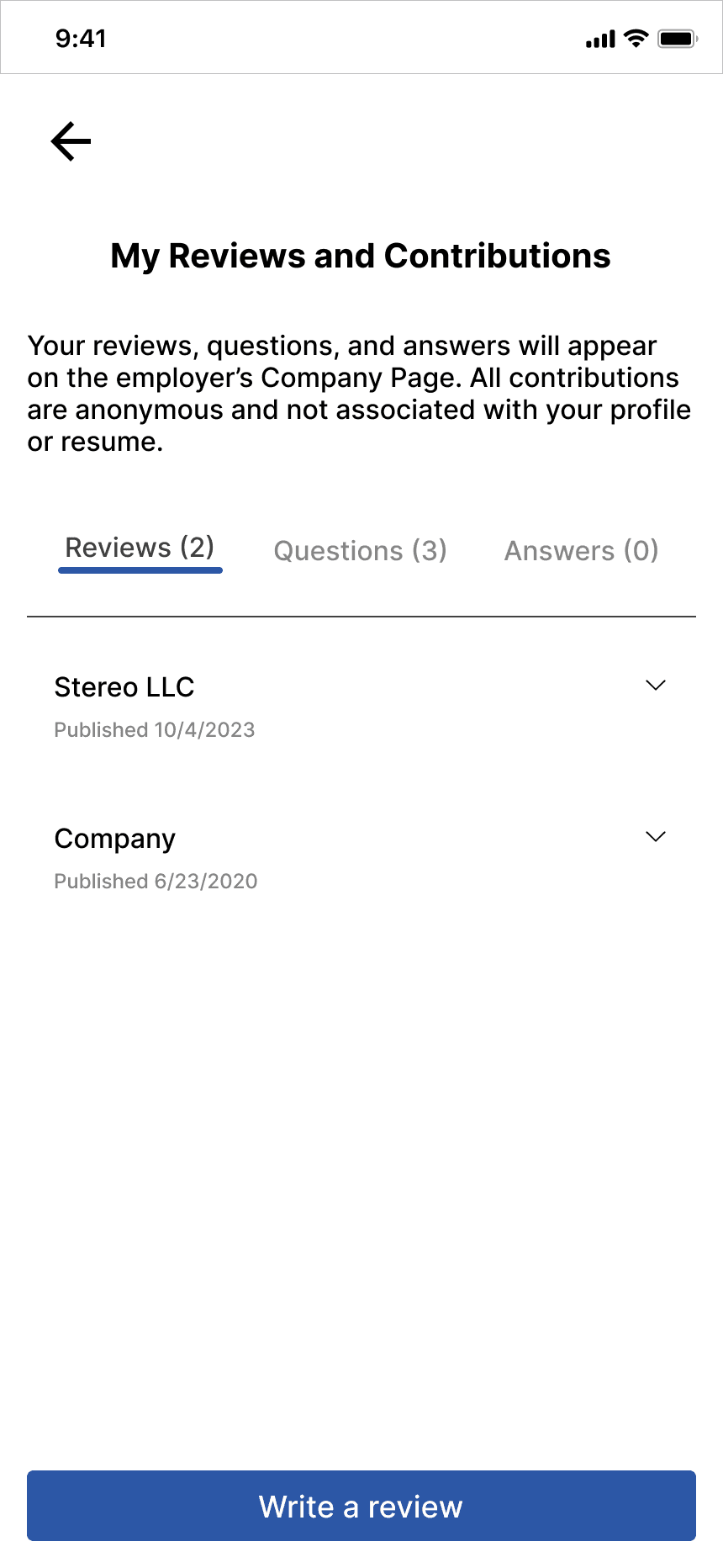

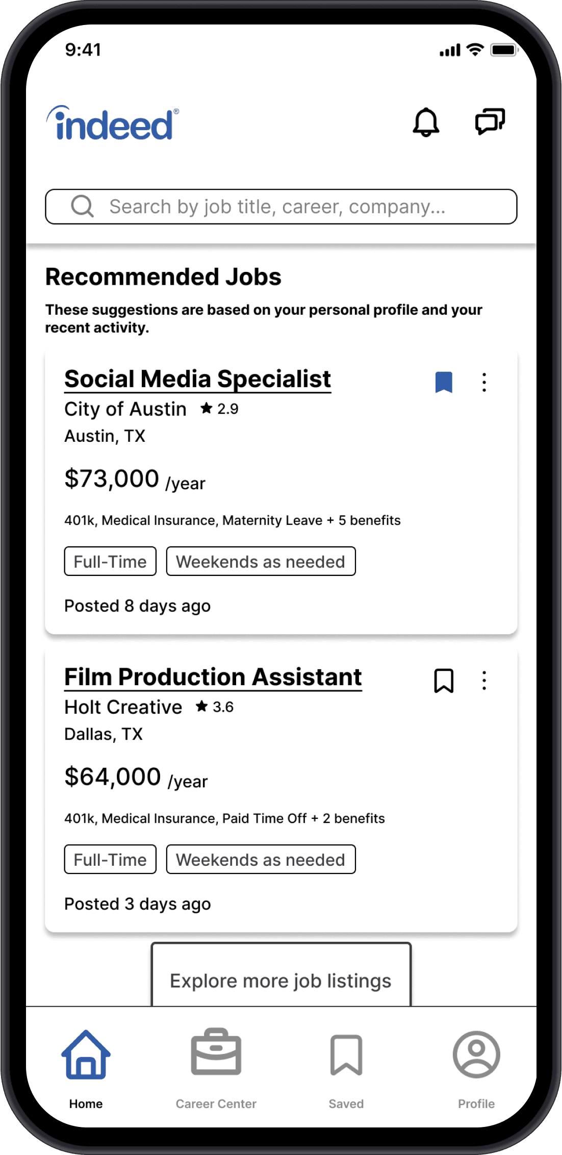
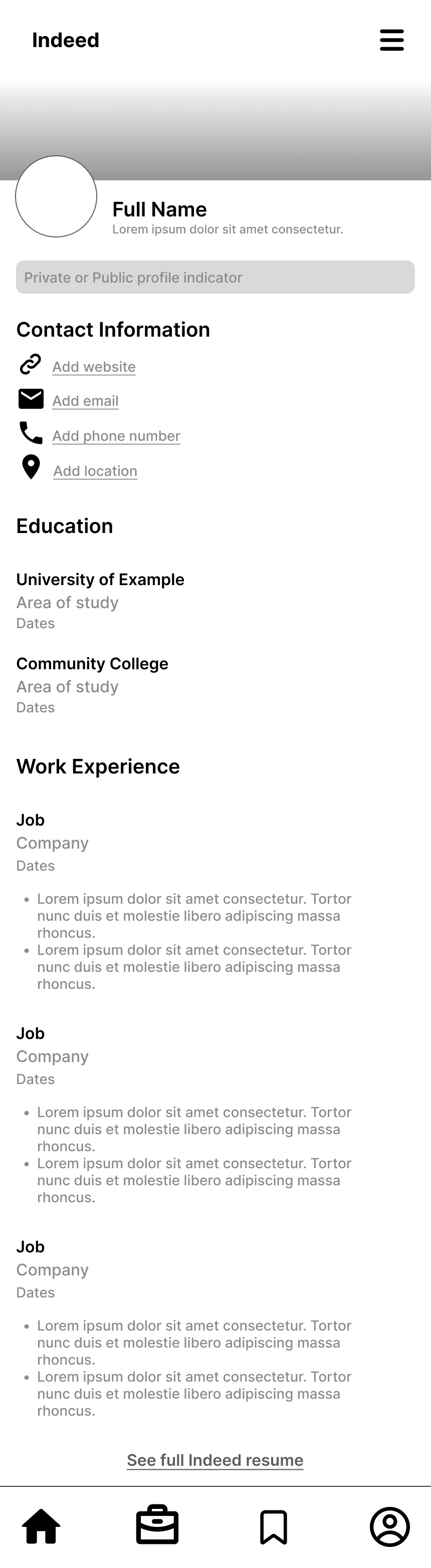
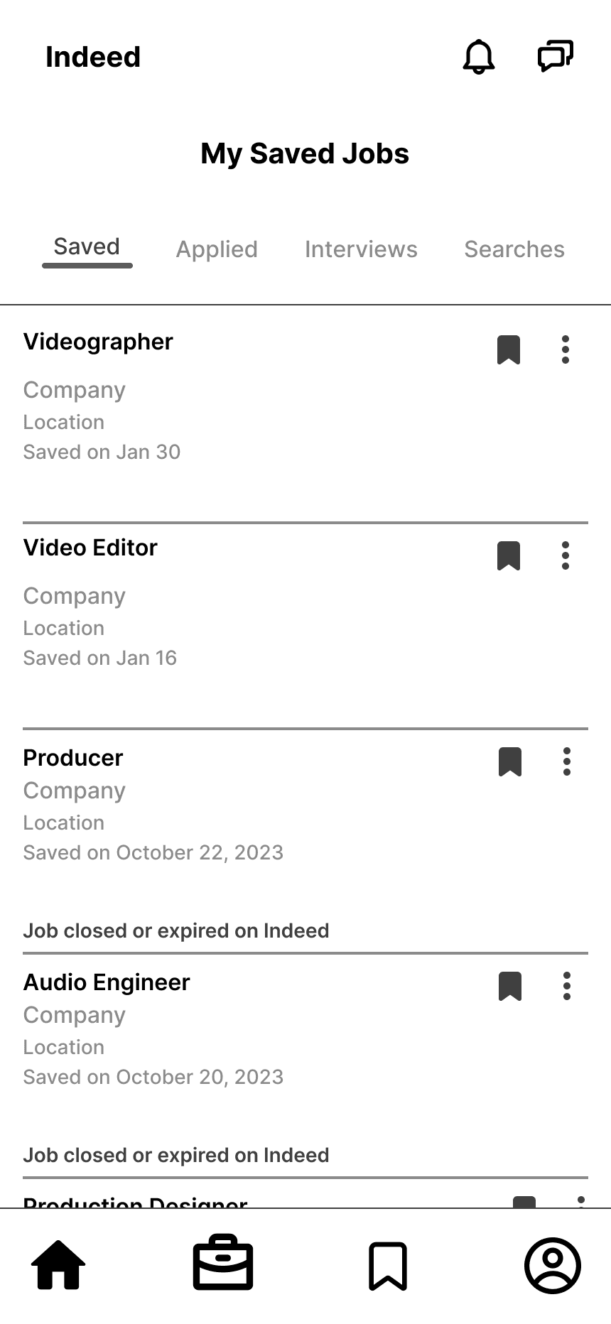
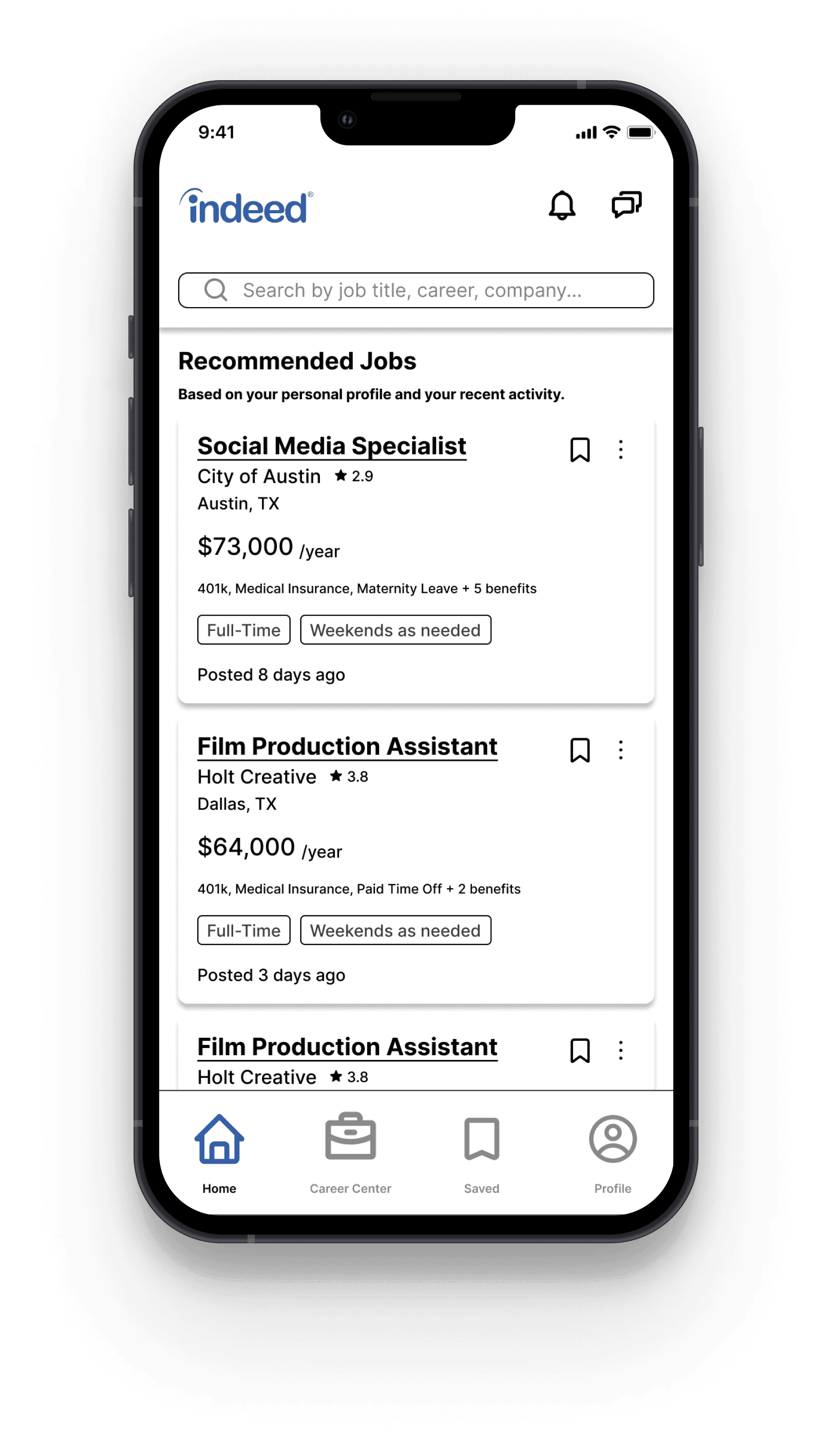
Homepage
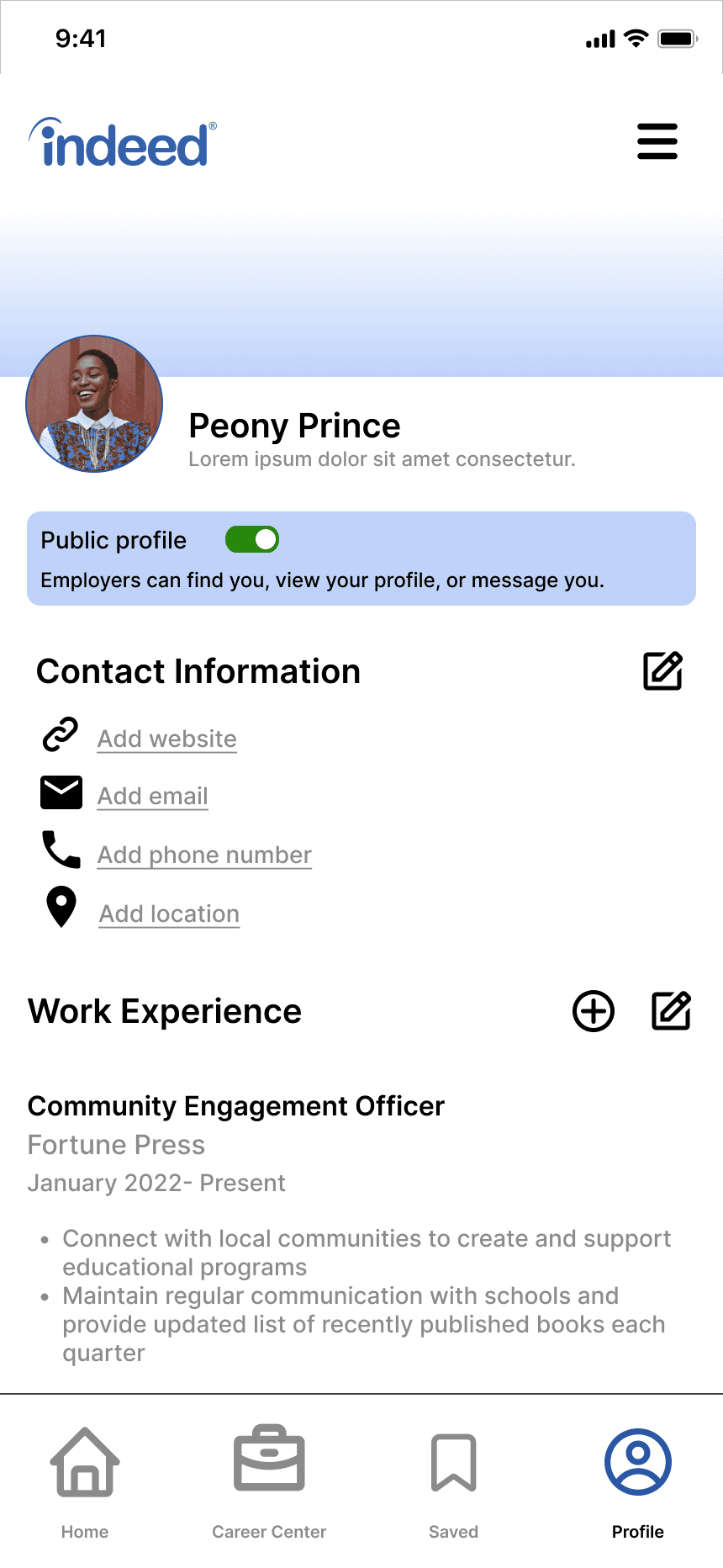
Profile
Menu
My Reviews
Write Review
Avg. time on screen:
5 seconds
45 seconds
3 seconds
5 seconds
N/A
Avg. # of misclicks to next screen:
0
3
0
1
0
Satisfaction:
Though there was difficulty finding where to write reviews, all testers navigated to the correct page in the navigation bar. The results of these tests show that the navigation bar is a successful solution to the pain points identified.
Features & Solutions
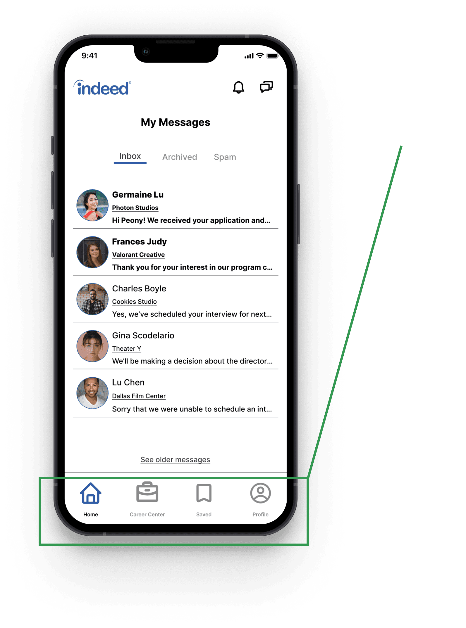
The top toolbar switches between two variations depending on which pages the user is browsing.
Top Toolbar:
Variation 2
The toolbar will display the burger menu when the user is on their Profile.
Variation 1
The toolbar will display the “notifications” and “messages” icon when the user is on the following pages: Home, Career Center, and Saved.
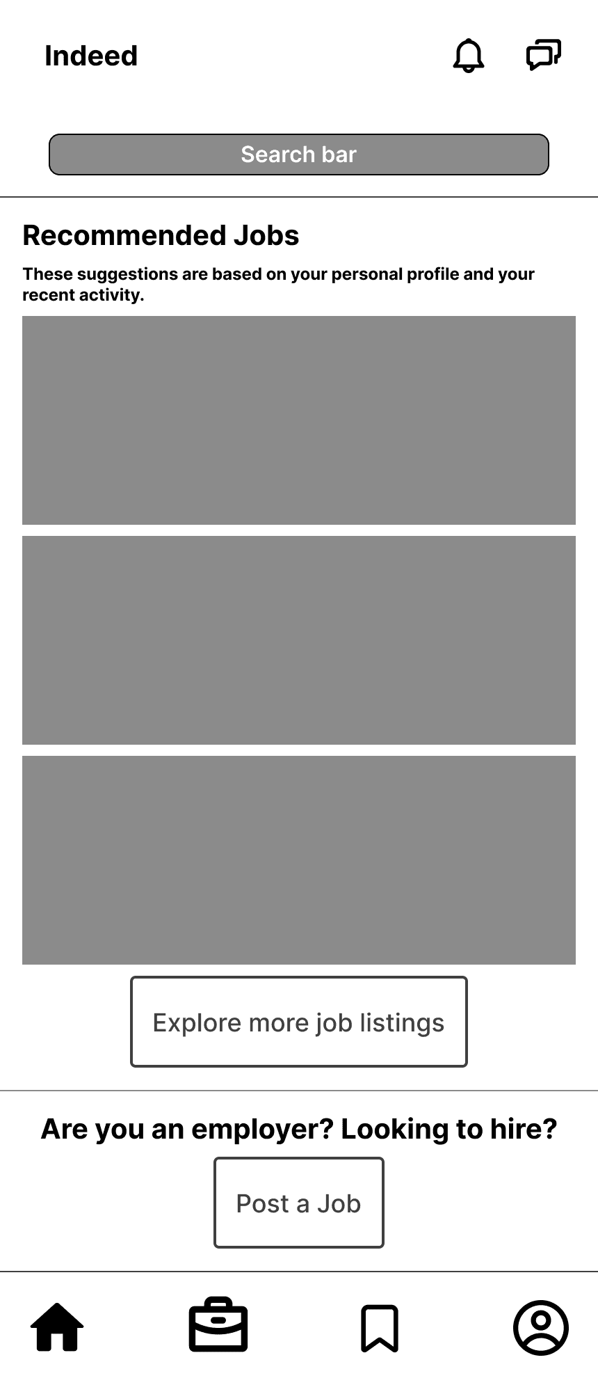
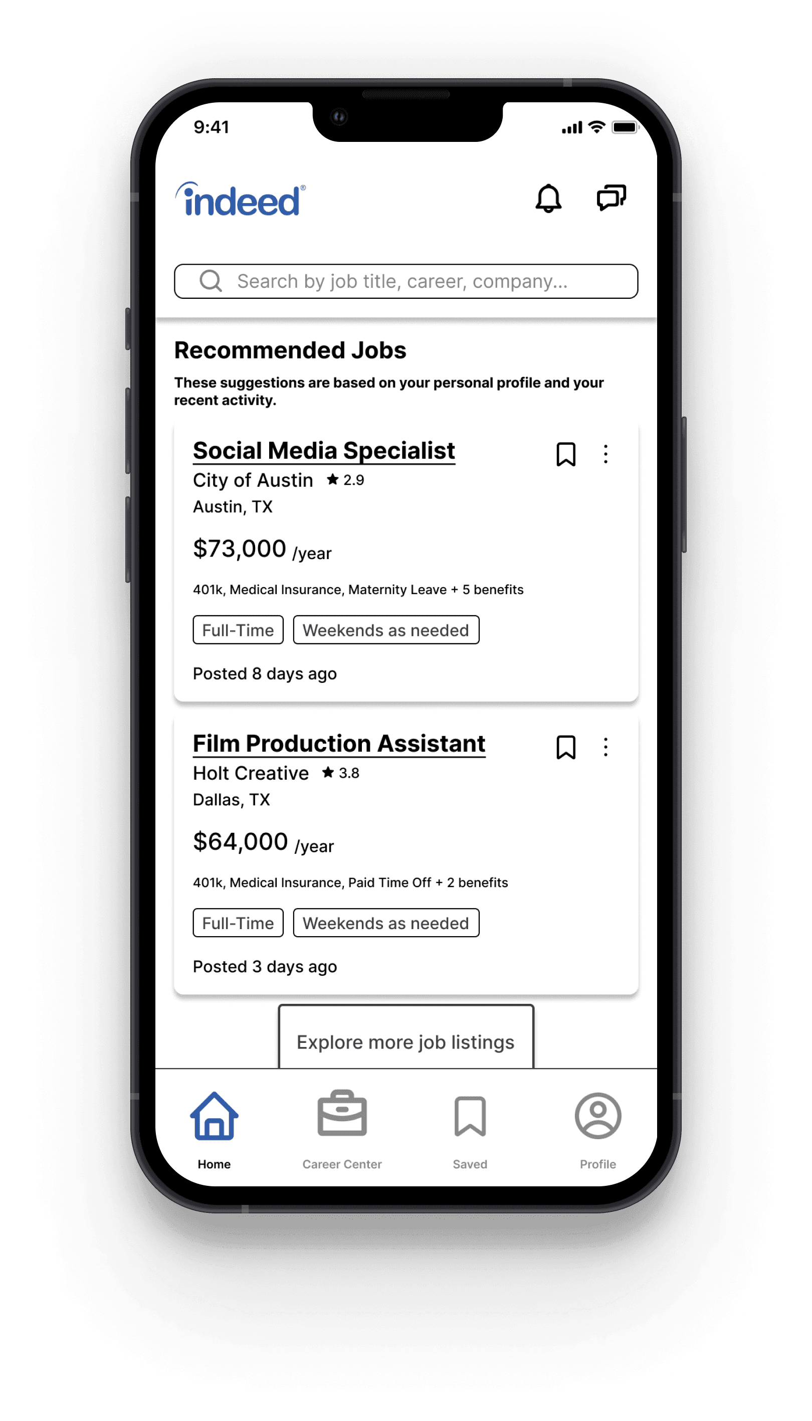
Home contains all of the “first things” users want to see when they open the app
Career Center is a hub for Indeed’s job market informational content and services
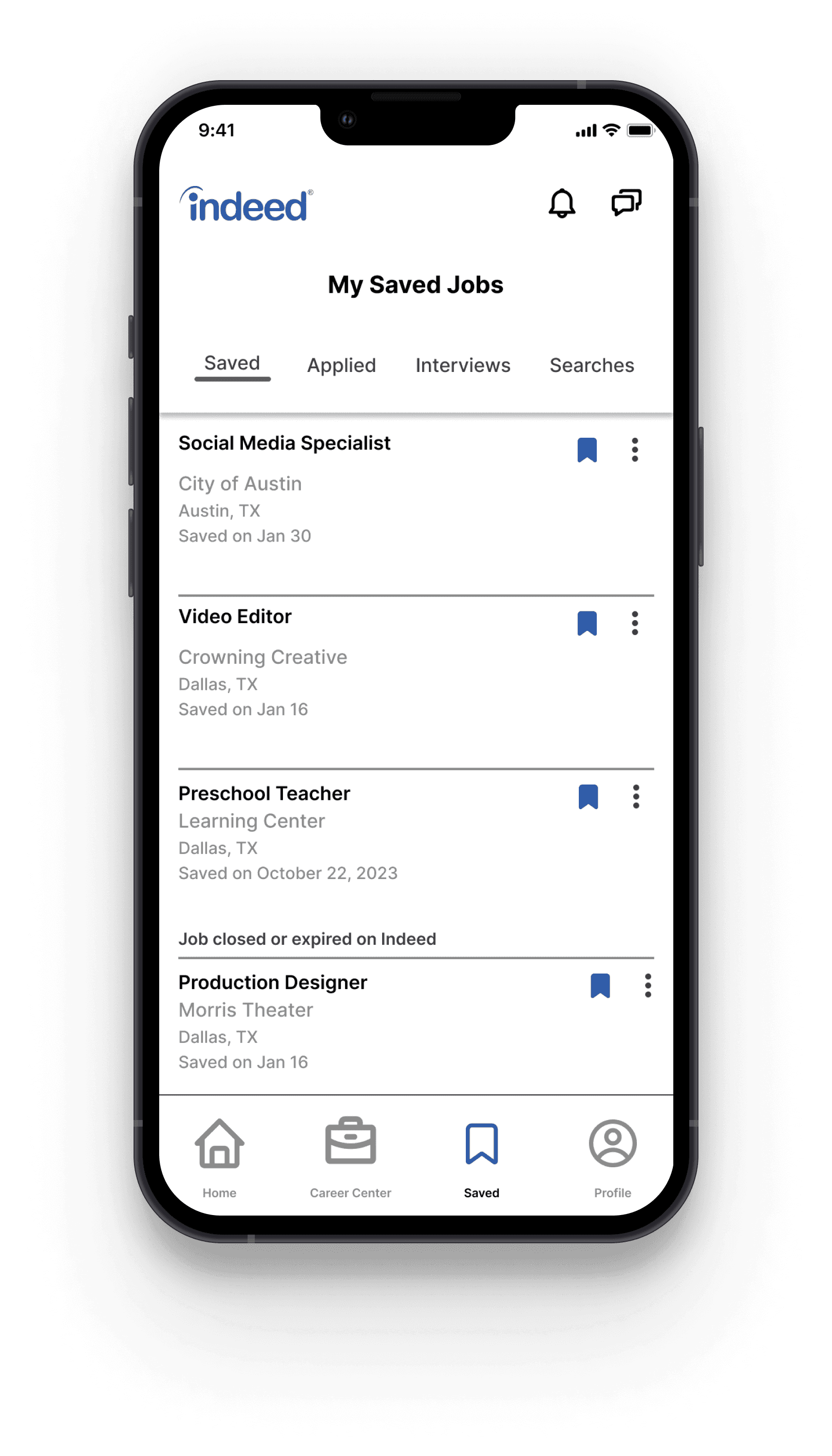
Saved contains content based on the user’s actions such as applying to a job
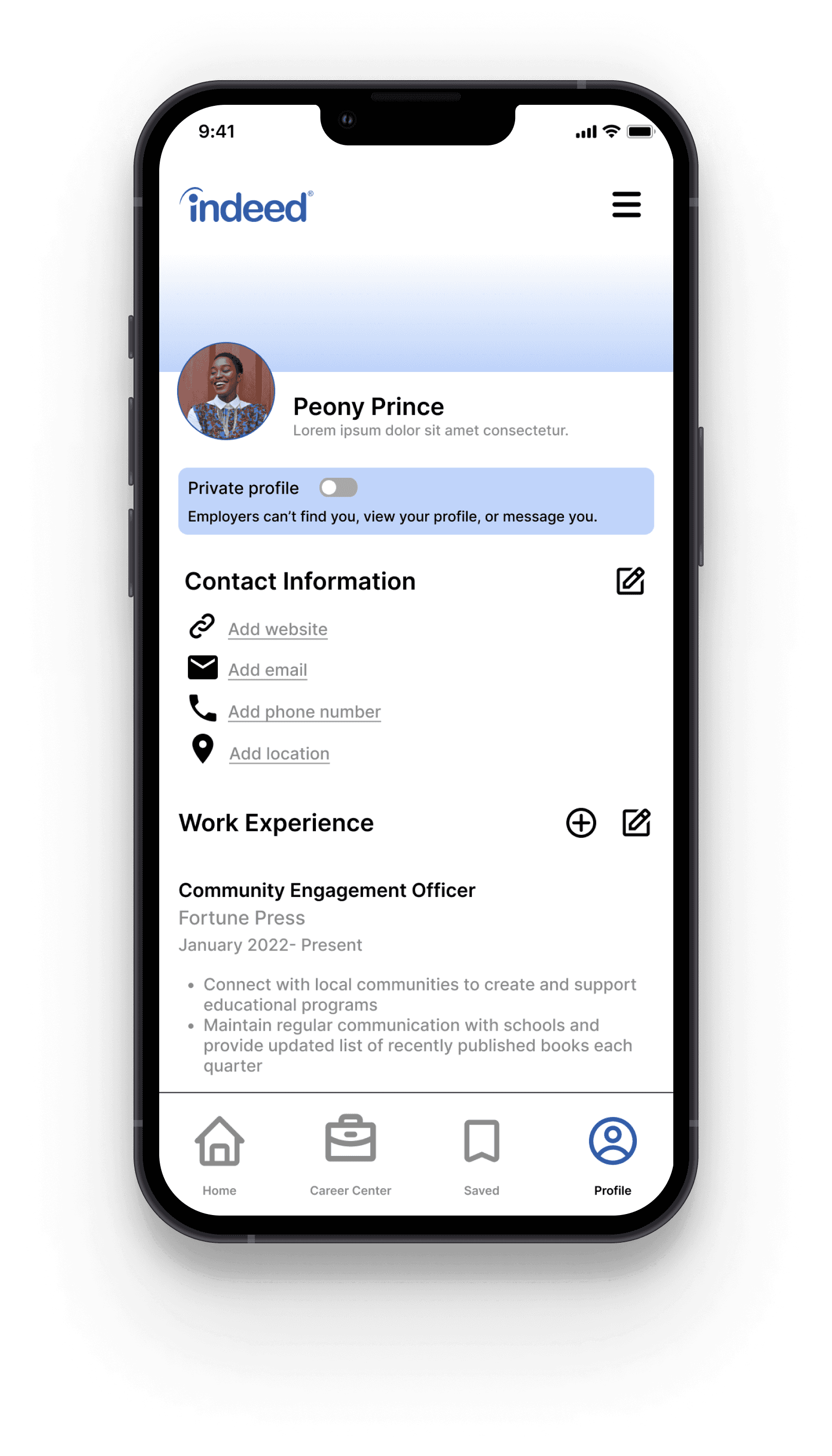
Profile is customized by each unique user to fit their resume and job goals. Profile can be private or public.
Bottom Navigation:
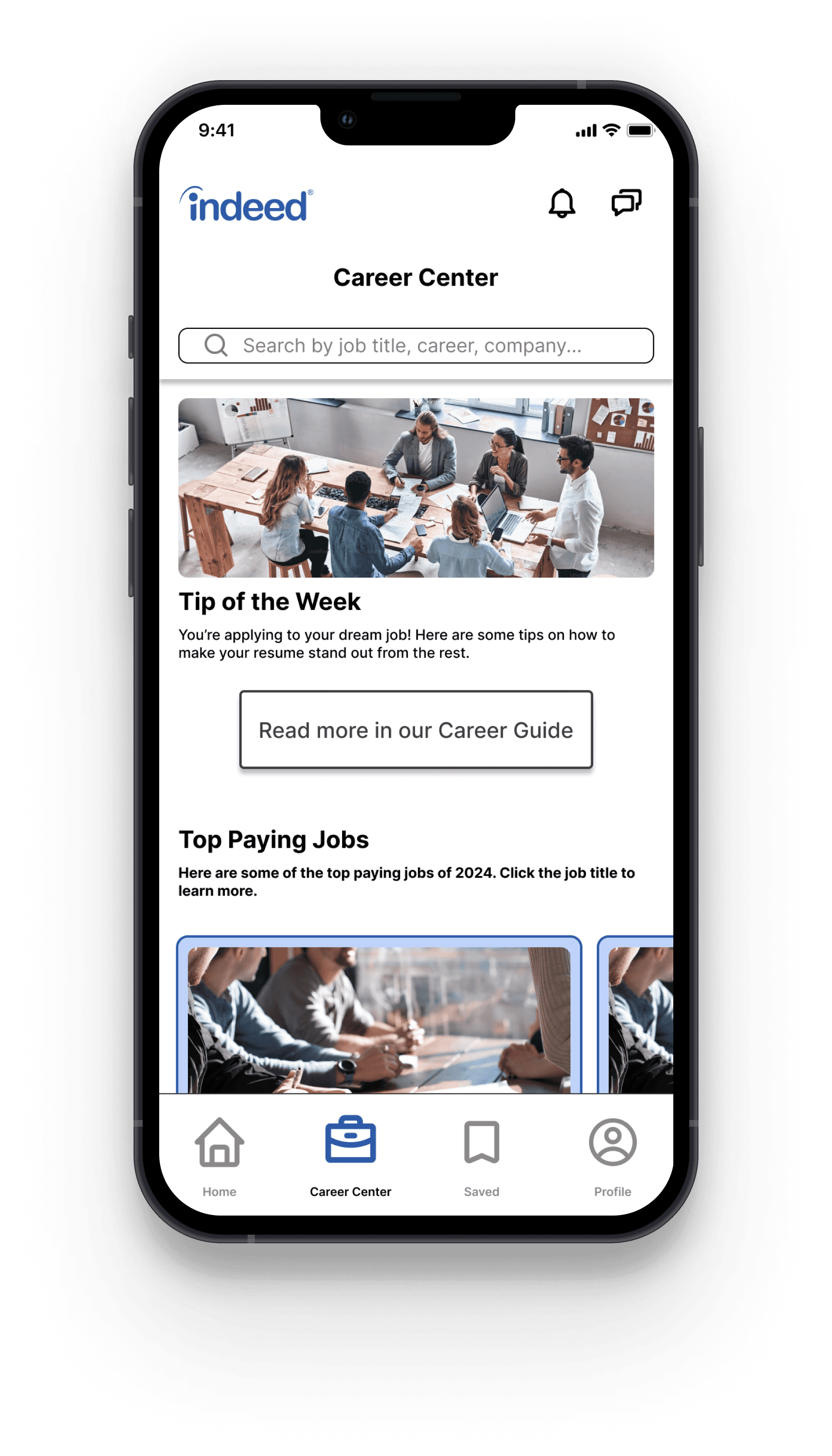
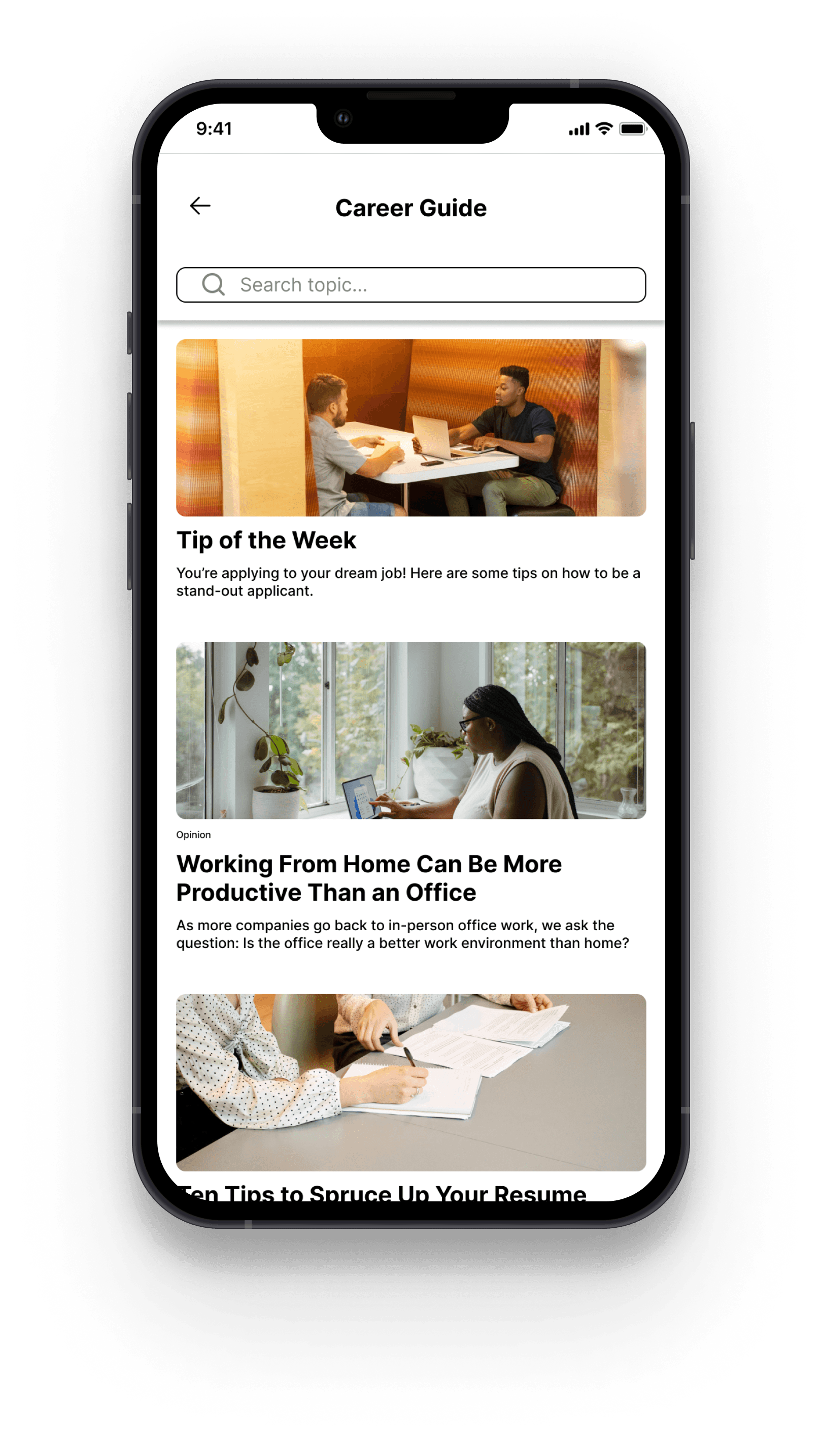
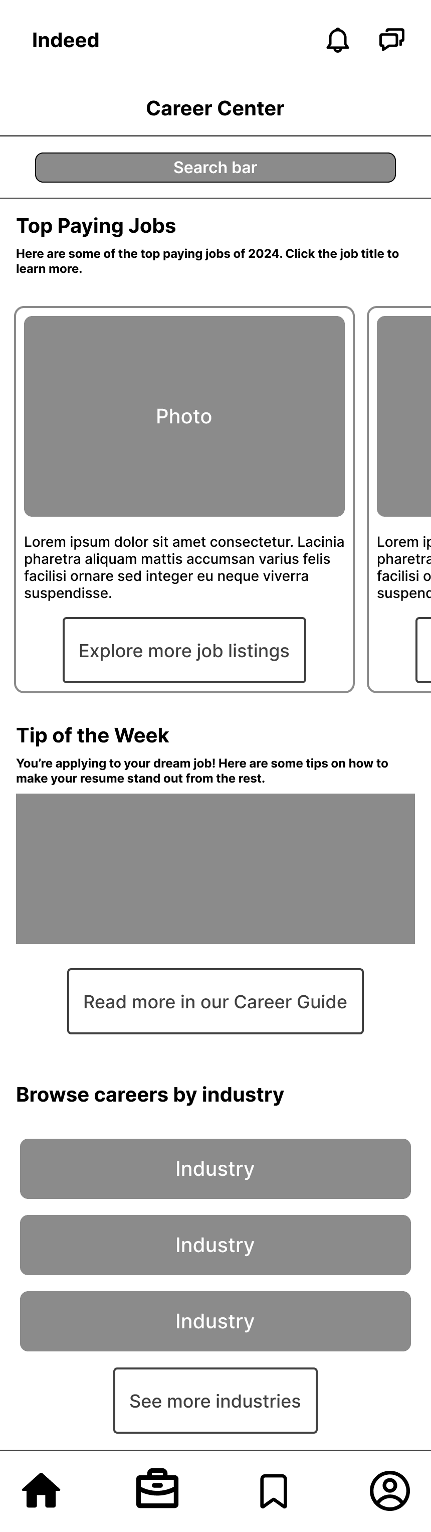
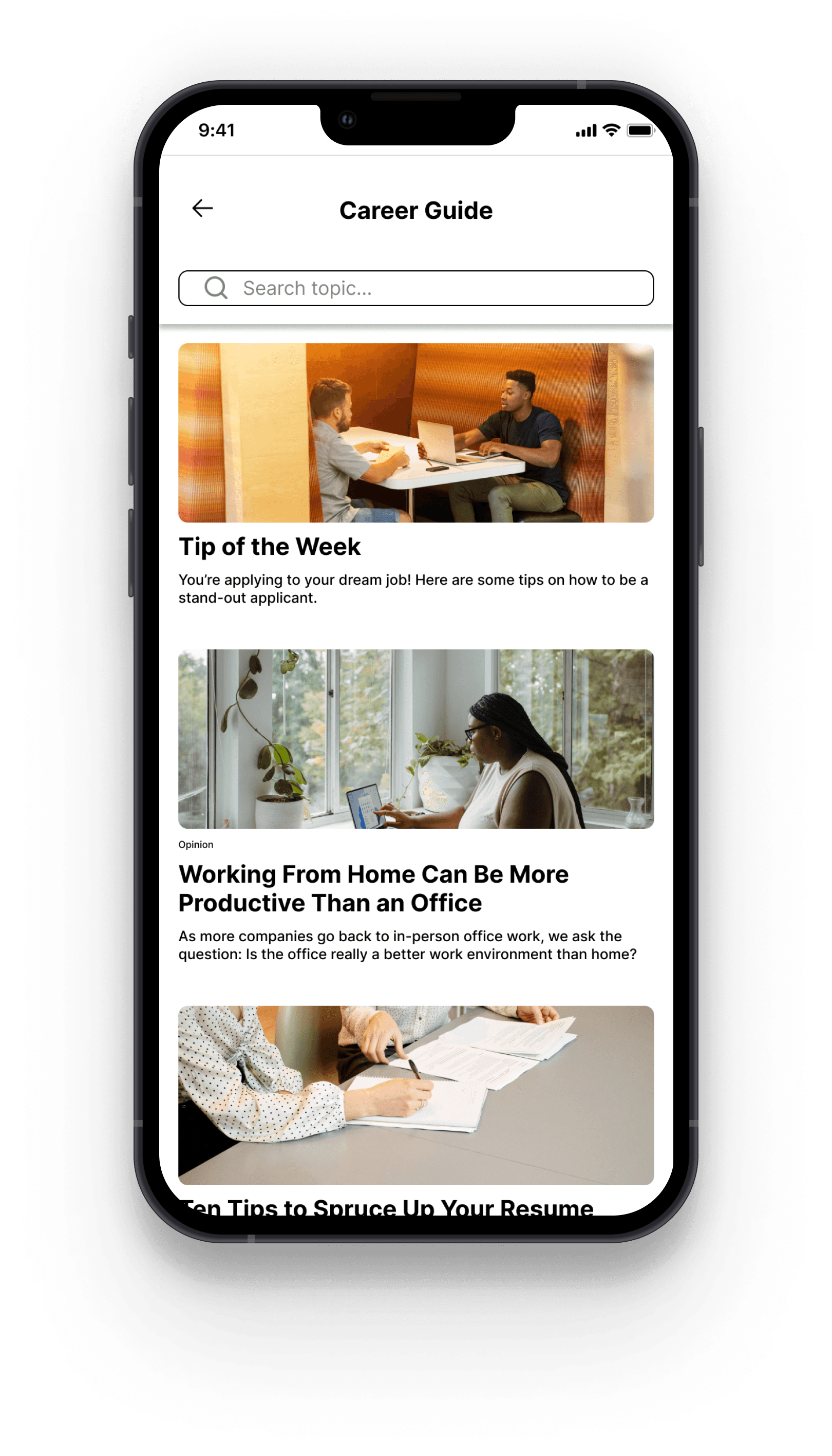
Creating a dedicated Career Center tab, allows users to more easily access unique resources to aid in their job search. Users can read job-search tips, browse companies, see ratings or rate previous employers, browse top-paying jobs by industry, check industry salary averages, and much more.
Career Center
Final Screens
Prototype testing showed that the navigation bars significantly improved app usability. The only change that I made after prototype testing was making the company names on the user profile a hyperlink.

Reflections
Since completing this project, Indeed app has added a navigation bar that is similar to the one I completed for this project. This shows me that my research and choice to redesign the app navigation is aligned with Indeed’s design team.
What did I learn?
Similar to my previous case study at Humanz Mediate, users like familiar design which is why so many of my interviewees referenced Instagram.
Most job search websites hold a lot of information and functions outside of just job listings, which is why it is necessary for navigation to be clear.
Personally, I really enjoy the research process. I find it really important to know what a user needs before jumping into designing. Even if I have an idea about what I might discover in interviews, I feel like I am always surprised and learning something new that helps me design better.
What would I do differently next time?
While creating the card sorting activity, I was limited in how many cards I could have. I think if I were to do the card sort again, I would try to do a more in-depth audit of app content and use wording that wouldn’t clue-in interviewees on where cards are “supposed to belong”. For example, for some interviewees seeing the word “your” or “my” influenced them to put cards under the Profile or Saved category.
When testing my prototype, I found a few instances where misclicks and hesitation existed particularly with the app menu. If I were to redesign the app, I would want to find a solution to the placement of the menu that is less confusing such as leaving the menu in the top toolbar of all pages.
If given more time, I would’ve liked to do more research on Indeed employer users and how they navigate the app and design with both job-seeking users and employer users needs in mind.
Check out my other work
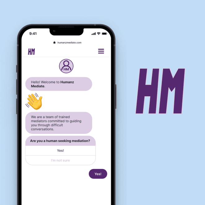
Humanz Mediate
Onboarding form for mobile web |
connecting humans with conflict mediators
User research, UX/UI, prototyping
View case study